PORTFOLIO/WEBSITE UPDATE IN PROGRESS – AUGUST 2026

Finance Dojang Logo Design

Project
Finance Dojang was a personal branding project I developed during Covid as a way of documenting and structuring my growing financial knowledge.
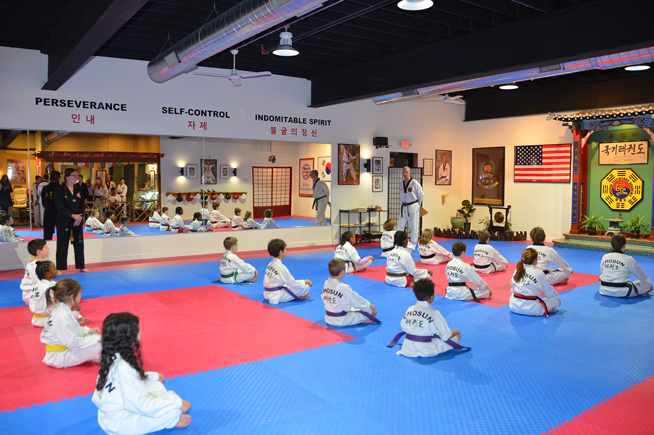
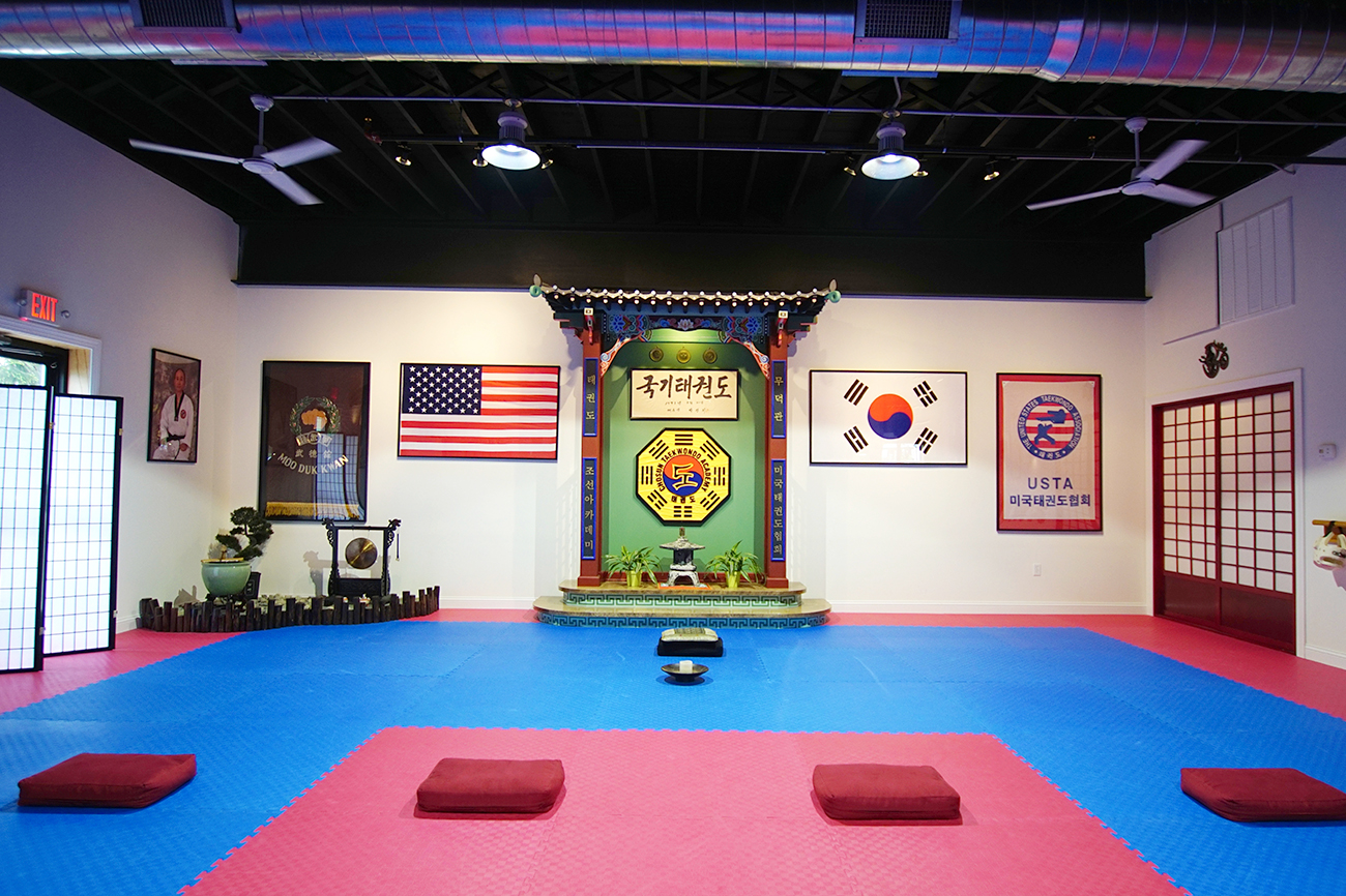
The name came directly from another major part of my life. I spent around 20 years teaching Taekwondo, and a dojang is the Korean name for the place where you train. The idea of a Finance Dojang felt like a natural fit: a place to learn, practise and improve through discipline and hard work.
The original plan was to develop it into a blog and YouTube channel. I began writing several articles, but ultimately decided I wasn’t comfortable sharing my personal finances publicly, so the project was paused before the wider brand was launched.
My role
Concept development, naming, branding, illustration, vector reconstruction and motion design.
Created using Adobe Illustrator and After Effects.
Developing the idea
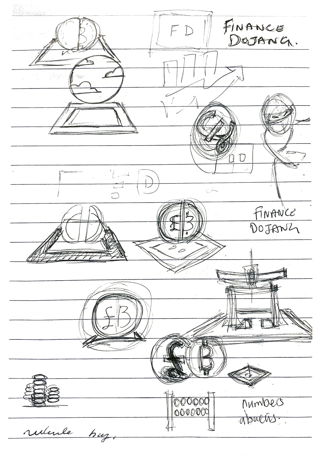
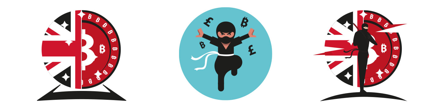
The early concepts explored a much more obvious combination of finance and martial arts, using currency symbols, martial-arts imagery and different logo treatments.
As the idea developed, I wanted the identity to represent something more meaningful than simply “money + martial arts”.
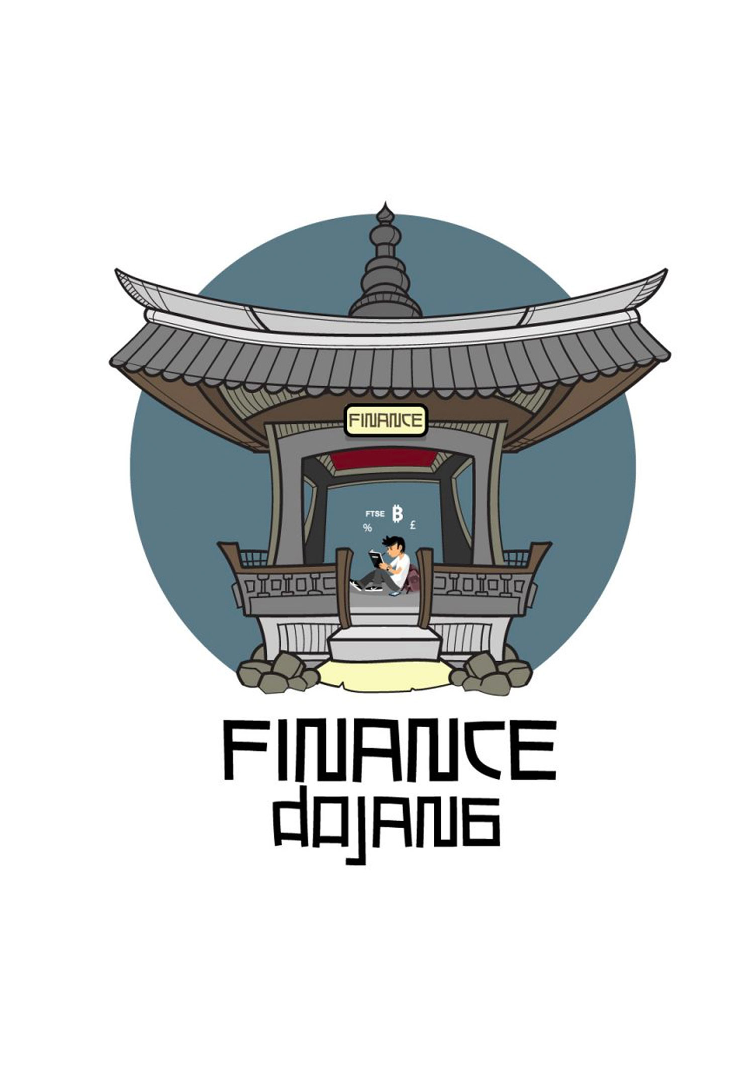
The central figure became a rough self-portrait, sitting with a notebook and working through ideas. Notebooks have always been an important part of how I think and learn, so the image represented the process of actively building knowledge rather than simply consuming information.
The numerical symbols around the figure represent those thoughts and ideas beginning to form.
Building the Dojang
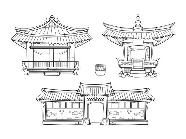
The building was based on an illustration by macrovector from Freepik that I particularly liked. Although the original artwork was supplied as a vector, its construction made it unsuitable for animation: it consisted of many small overlapping shapes rather than clean, independently controllable elements.
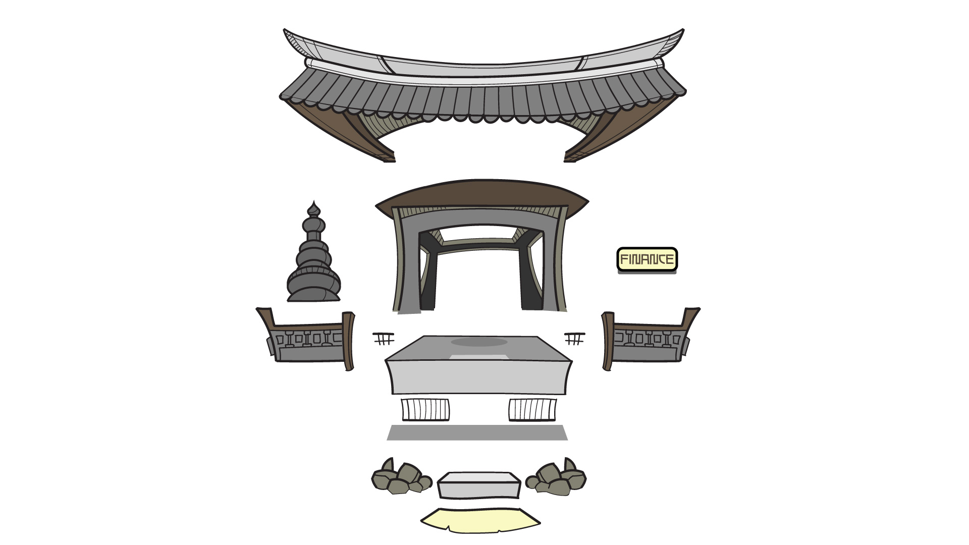
I therefore reconstructed the artwork in Illustrator, redrawing and reorganising the building into the individual layers I needed for animation.
That meant creating missing geometry and making decisions about how architectural details should overlap and assemble. For example, elements such as the pointed roof detail needed to sit behind the front roof edge so that they would appear correctly as the building formed.
It became less about adapting an existing illustration and more about rebuilding it as an animation-ready asset.
Bringing the identity to life
The animation begins with the figure working alone, scribbling in his notebook.
The Dojang then gradually assembles around him.
That movement became part of the meaning of the logo: knowledge starts as a collection of individual thoughts, but learning gives those thoughts structure and somewhere to belong.
The Finance sign on the building was deliberately influenced by the signage I remembered seeing outside martial-arts schools in old kung-fu films, helping connect the financial theme with the visual language behind the name.
The finished animation was created in After Effects after the vector artwork had been rebuilt and separated into the necessary layers in Illustrator.
What the project demonstrates
Finance Dojang is one of those projects I enjoy because it required several different creative disciplines rather than a single executional skill.
It started as a rough idea and moved through naming, sketching, rejected concepts, illustration, vector construction and finally animation.
For me, that ability to take an idea from an initial note or sketch through to a finished piece is as important as any individual software skill.